

We Feel Fine: An Almanac of Human Emotion
Jonathan Harris and Sep Kamvar
Scribner Book Company, December 2009
ISBN 1439116830
Featured image: We Feel Fine project poster
“We Feel Fine – An Almanac Of Human Emotion” is a hardback book that in just under 300 pages of well designed montages, data visualisations, diagrams, illustrations and text presents and analyses the data gathered by the We Feel Fine project. Started in 2005 and launched in early 2006 by Jonathan Harris and Sep Kamvar, We Feel Fine is based around a database assembled using a webcrawler that searches the blogosphere for statements of the form “I feel” or “I feel like”. Any matches are stored along with as much contextual data as the webcrawler can find (a photograph nearby in the blog post, the poster’s age, gender, and location, local weather). The database contained twelve million such entries by the time the book was published.
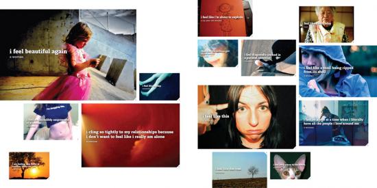
Sections of the book categorise statements of feelings by age, gender, the location of the poster, and subject of the statement. Individual statements are presented superimposed over images found in the same blog post. The photographs presented with their accompanying expressions of emotion have a high-contrast, shallow depth of field, and highly focused look that resembles Lomography. But this is a product of the presentation of photographs on the web rather than an hipsterly ironic invocation of the contingent aesthetics of mass photography. The images are for the most part JPEGs, and show the contrast, mach banding and visual noise of that technology.
The montages of “I feel…” statements in a standard format superimposed over an image found in the same blog post serve to provide a (sometimes incongruous) context for the statements that the project is based on. They resemble Gillian Wearing’s “Signs that say what you want them to say and not Signs that say what someone else wants you to say” 1992-3 featured photographs of people holding up placards on which the artist had asked them to write down what was on their mind. Going back further into the history of art, the montages and in a novel way particularly the data visualisations and graphs bear comparison to Vermeer’s seventeenth Century paintings of bourgeois social relations and reverie. Both “Girl reading a Letter at an Open Window” and “We Feel Fine” present social class, social self-presentation, advanced communication technology and consideration of the thoughts of others in a medium and way that epitomises the way people see things in that era.
The book’s volume of data and graphics quantifying social phenomena might resemble a “state of the blogosphere” corporate social media report in some ways, but its presentation directs attention back to the emotions featured rather than trying to tie them to any corporate or governmental agenda. This is a book by, about and for individuals in contemporary mediatised society. I found reading it became quite overwhelming sometimes once I had adjusted to its presentation.
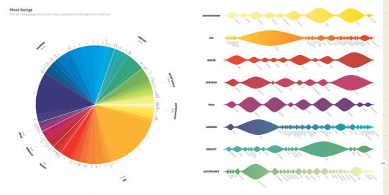
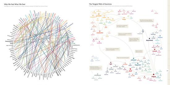
Dictionary definitions, statistical breakdowns of the kinds of words, ages and genders of bloggers and other demographic and affective data are presented in compact graphic form on every page, and larger charts show more general conclusions. Feelings, or the words used to refer to them, are shown to vary between genders and as people age. This is an exemplary application of Edward Tufte’s science of the graphical presentation of information. They even have sparklines. But that science is applied to data that is at its heart qualitative rather than quantitative.
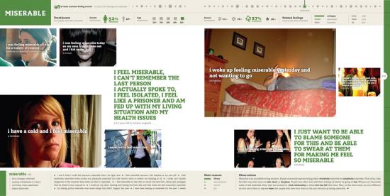
Such “data visualization” was a hot trend in 2009. Visualisations of crime rates, corruption, climate change and other issues can be produced using such data, and have become an important weapon in the arsenal of visual persuasion. On the We Feel Fine web site, feeling data is mapped to coloured blobs in an interactive user interface to the constantly updated (every minute) database. In the book, feelings and demographic information are processed to produce graphics that represent the prevalence of feelings over time, between genders, in different locations and in relation to each other. But as visual persuasion this is directed back to the vividness of human, qualitative experience rather than a more political or economic agenda.
“Sentiment analysis” was also hot trend in social media marketing in 2009 and its limitations quickly became apparent. Current systems simply cannot handle irony, sarcasm, regional differences in the usage of words and in many cases even simple negation. The We Feel Fine system is an exercise in gathering affective or sentiment data to visualise, but it avoids the pitfalls of sentiment analysis by automating only the gathering of the statements of emotion themselves, not analysis of how they relate to what they refer to. This is a classic example of well-chosen limits strengthening a project.
The problem of the relationship between qualitative (how you feel) and quantitative (how many people feel what you feel) data and how to deal with this in a non-voodoo way are avoided in We Feel Fine because of this.
Another 2009 hot trend was “big data”, the assembling of datasets that vary from many megabytes to many gigabytes in size. Datasets from regional and national governments, scientific research and freedom of information requests can be used in “data mining” to search for facts among the numbers. The We Feel Fine system is a good example of a big data dataset (and API, application programming interface, for accessing that data over the web). Unlike global temperature data it neither offers the possibility of objective accuracy nor involves any great risk if it lacks it. But it does reintroduce the human subjectivity that big data threatens to replace with numbers.
The striking thing about this is that although the We Feel Fine book is very much of the zeitgeist for 2009 the web-based system it presents started five years ago in 2005. At that time blogs were regarded by the mass media as disposable, narcissistic and somehow inauthentic. They were an unlikely subject at that time for art concerned with the authentic expression of emotion. We Feel Fine’s history, subject and results therefore both prefigure and go beyond the current state of the art in Internet social and corporate culture.
Harris and Kamvar are admirably candid in laying out the history, methodology, technology and in the case of the book’s production even the finances of their project. The code listings included in the book are tantalising glimpses into how the We Feel Fine server works, allowing a rare chance for students and artists to study such a system, and are licenced under the GPLv3. The book is under the obscure but principled Creative Commons “Founders Copyright” licence which will automatically expire the copyright on the book in twenty years time. This is all invaluable for critique and study of the project by artists, academics and anyone with an interest in art and technology, and more artists should do it.
In the FAQ and other essays contained in the book Harris and Kamvar are open about the methodological strengths and weaknesses of the We Feel Fine system. They acknowledge the limitations and demographics inherent in profiling bloggers (who are younger, wealthier and more technologically savvy than is usual). They also make a convincing case for the very real conceptual strengths of the project, discussing how the system holds up as science and statistics. And the project itself is overwhelming as an aesthetic and, strangely, somehow as a social experience.
Even if we don’t deny or question the existence or status of emotions for ideological reasons, do we know what we really feel? And even if we do know what we really feel can we really express it in a way that will be understood by others? We Feel Fine doesn’t address these questions. They are outside of its scope. Its acceptance of sentiment at face value and its mechanical (re-)production of representations of sentiment might look like the hallmarks of kitsch. But that would deny the subjectivity of the original authors of the expressions of sentiment that We Feel Fine processes. And a progressive art needs to represent the masses, not merely rulers and pop stars. Not everyone will be feeling ironic or critical on any given day. Given this, the transparency, scale and effectiveness of We Feel Fine mean that ideological objections to big data, to emotional taxonomies, or to the very idea of emotion face a problem in the project’s aesthetic and affective success rather than vice versa.
Some of the stories found while researching the posts and presented in the book are heartbreaking or uplifting, but the statistical nature of the project makes these outliers – they are rare events and can be identified as such. What comes through from page after page of casual statements of feeling is an impression of the range of human experience, or at least the range of human expression. If you can adjust to the montage format and the diagrams then the book can inspire sympathy, pity, and joy for your fellow human beings.
The book ends by considering the philosophical and spiritual meaning of feelings, how they affect our lives, and what we can do about this. The data gathered to back up this consideration makes the conclusions both persuasive (this is a paradigmatic representation of humanity) and surprising (that would be telling).
We Feel Fine faces up to the challenge of making Internet art that realistically deals with the scale of the contemporary web. It does this by tackling the millions of daily new entries in the blogosphere but crucially it retains a focus on qualitative, subjective human experience. In its engagement with multiple levels and kinds of representation, from emotional taxonomies and statistical methods to digital photography, weblogs, and data visualisation, it shows just how broad are the range of systems and modes of depiction that artists can and possibly must deal with today. And it’s a project that simply wouldn’t exist if the people who made it couldn’t code.
We Feel Fine is a persuasive and insightful portrait of the individuals that make up the blogosphere. It can be overwhelming in terms of the amount of information and in terms of the volume and strength of emotion presented, but that is part of what makes it vivid. It is a paradigmatic, realistic and persuasive depiction of the qualitative experience of individuals within networked information society.
The text of this review is licenced under the Creative Commons BY-SA 3.0 Licence.