
Pencil / Line / Eraser, the current exhibition at Carroll/Fletcher, spanning both the main Eastcastle Street gallery and their nearby Riding House Street project space, is well worth a visit. It’s never less than engaging and there are several pieces that lodge, linger and ferment in the mind long after the bus or train ride home.
They describe the show as “surveying recent works in expanded drawing which use paper and line as a point of departure” and, let me say again, whatever I have to say that is critical you won’t waste your time there. Far from it.
This review will be in two parts – first, & with an innocent(ish) eye, I’ll sing the praises of the work that itself sang to me during my visit and then I’ll vent about the things that irritated me, more a question of contextualisation and commentary than of the work itself, although in today’s text ridden and intention trumpeting artworld it’s sometimes a little difficult to unpick one from the other. Since the artists cannot completely escape responsibility this has consequence for any assessment of some of the work.
In a space of their own, a little into the main gallery, there are three pieces by the Portuguese artist Diogo Pimentão and they are delicious – large pieces of heavyish paper covered with graphite and folded, draped and rolled. Two are delicately attached to the wall so they appear to float there and the third sits up on the floor like a long fierce graphite flue.
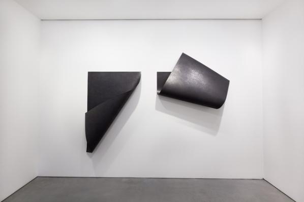
The works capture superbly paperishness: its particular foldiness, rolliness and drapiness and its ability to suck up pigment in large quantities (fields rather than lines here) Indeed the graphite covering softens the folds and creases so what we experience is a kind of Platonic report on the qualities of paper. The urge to touch this gorgeousness is almost irresistible.
The works strongly recall Richard Serra (though what I perceive as his machismo is entirely absent) – his early large scale drawings using a single dark medium, ink or oil stick, but also the torque and defiance of gravity that is so much part of the steel pieces. I’ve no idea whether this is a conscious borrowing but to point it out is not to criticise the work in any way because it feels like a commonality of subject matter –the stuffness of stuff – rather than technique, despite deceptive (and magically so) similarities of appearance. (It takes a couple of beats to fully realise that Pimentão’s work is work on paper and not something else.)
Further along to the left in the stairwell is one of a number of films by Wood and Harrison. Some of their work strikes me as a tad glib – smart but somehow too undemanding of thought and which tickles the viewer’s tummy (and amour propre) a bit too readily. And I apply this to their other pieces in this show – the paper which moves (conveyor belt?) beneath hands holding both a pencil and then an electric eraser makes me want to shout “I get it, OK , I get it! I get Rauschenberg, I get updating pieces to the digital era, I get a certain fashionable emptiness…”
The piece in the stairwell, though, is a different kettle of fish. Entitled ‘Fan/Paper/Fan’ it does what it says on the tin. A pair of hands places a piece of paper between two fans blowing towards each other in such a manner that the paper temporarily defies gravity and stands on its edge on its shorter side. Well, not so much stands as staggers like a gleeful drunk, manic ballerina or even someone just desperate for a pee. Then it falls and the hands re-position it, and maybe it’s just me (and even if, I offer it to you as an affective pathway to the work) but here, rather than a closing off or a patness, there is a tremendous opening out – the metaphor of the paper’s embodiment resonates with the human figure who intervenes and helps (or tasks) it. It’s difficult to resist anthropomorphising the fans, too, as windheads in map corners or Tweedles Dum & Dee. I’m going to use the artworld kiss of death term “moving” to sum it up.
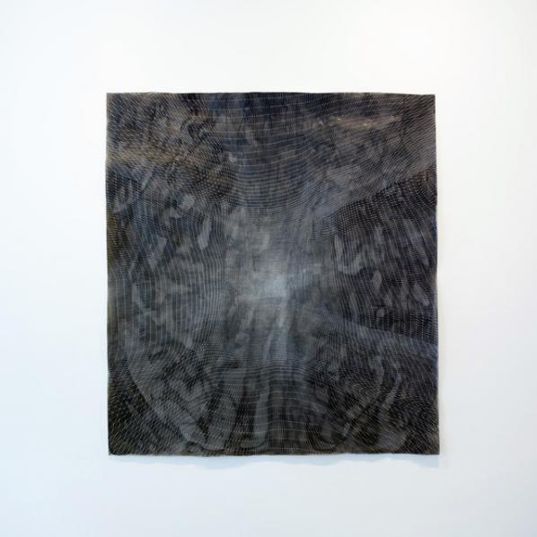
The second two artists I want to hymn are to be found in the project space. The first is Sam Messenger who makes large scale abstract drawings on dense paper which is subjected to some sort of weathering process – hence, I assume, the mysterious listing of saltwater in the description of one. The net or skein of white pigment which floats upon a dark and varied but subtly modulated wash is applied according to some sort of Fibonacci based algorithm (as per usual with artists and maths the actual detail is elusive). Much play is made of the ceding of control which goes with this, together with the, therefore somewhat surprising, point that this algorithm doesn’t permit a prediction of the drawing’s final state at any point before this is reached. I get it, though, I think – the set of conditions must be firm enough to follow straightforwardly and to yield visually coherent results but at the same time there must be some choices, forks, within the procedure. What this yields is a complex detail nothing short of exquisite. Particularly lovely is the way that the drawings bulge away from the wall and also just how lost in their surfaces one soon finds oneself. It took me a little while to believe that the white “surface” network was not applied in some mechanical way (especially given the prevalence of mechanical /digital assistance/participation in the work of some other artists in the show) but close and detailed examination reveals uncertainties in marking that could come only from a human hand.
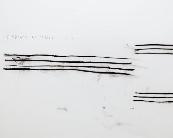
The final piece in this tour of highlights and, on a best till last basis, the one which affected me the most is a single piece by Christine Sun Kim, about whom more after I describe both the work and my first response to it. We see a drawing of a text, of three systems of horizontal lines resembling music manuscript staves (though in each case one or more lines short of the usual five) and smudges. The largest of the smudges and one which suggests it contains some colour – it’s curiously difficult to tell, I think it does – sits athwart the middle system of lines. Elsewhere there are much smaller patches which presumably arise out of a loose way of working with the charcoal of the lines. These lines themselves are gorgeous, varying markedly in width (but remaining lines, not shapes) and performing a similar balancing act with their relation to the horizontal, from which they depart but never enough to threaten our reading of them as such. Above the top left of the system of lines there is a text in clear and deliberate but slightly spidery sober brown capitals which reads FEEDBACK AFTERMATH. “Sounds like the name of a heavy metal band,” I remarked to my companion, who laughed gamely. But there is something bold and mysterious about it. After the band name, motivated in part by the horizontality of staves, their wavering might conjure a seismographic recording, or simply (and especially in the context of this show) some kind of algorithm at work. All this far from exhausts the visual pleasures of the piece. The central positioning of the marks, the feeling of a space divided into mark and void but at the same time a void graduated from nothingness up through a series of increasingly visible smudges. The palpable sense of the performative in a drawing like this. Oh it’s great! I wish you could see it! You can! (until Sept 13th 2014) Go.
On reading the handout we discover that
Christine Sun Kim, who has been deaf since birth, explores the materiality of sound in work that connects sound to drawing, painting, and performance. Her performances are often the starting point for works on paper that display witty evocations of powerful sounds or loaded silences.
I quote it not to flaunt my perceptiveness but to observe how vigorous and alive the work is even without contextualizing info. It wouldn’t matter a two-penny damn if read the “wrong” way either, it’s the sheer power, variety and beauty of the mark-making and its appeal across a whole range of things from cultural codes such as music and language, through graphs and charts through to the facts of our embodiment – our perception of dark and light, our manual dexterity or surrender to chance, the need to play, the right to say ‘fuck it!’ and leave that mark there; to own it.
So what is my beef? Part of it lies in the curatorial notion of “expanded” drawing, a conceptual movable feast. It implies some kind of comprehensible set of practices which make drawing –what? –more expressive, more up to date, capable of things that were previously not possible… I don’t know, neither do you and neither does anyone. At its most straightforward one could read it as works made which are somehow adjacent in some way to drawing –so a number of works involve moving image works of drawings or the act of drawing. But hold on –there’s a perfectly respectable word for this which is animation or, if this is stretching it, moving image work with drawing as its topic. I would be reluctant to call these works themselves drawings, expanded or no, with the exception of Fan/Paper/Fan where a path is drawn by the jittering paper. Likewise much play is made of the uses over the last forty years of mechanical means of ..er..drawing. Except one feels the weight of history and usage would fall more appropriately behind the simple print.
It probably wouldn’t be worth losing any sleep over it all except this comes to a head for me in two large scale works, one at each site. The first is a piece by Raphael Lozano Hemmer whose
Seismoscope device detects vibration around it, from footsteps to tectonic shifts, and records this vibration on paper using an automated XYplotter. As the Seismoscope registers a seismic wave, it is programmed to draw an illustration of a single 11th Century Sceptical philosopher, over and over again. The actual traces of the drawing follow a random path, while staying within the portrait image that has been burned into the memory of the device, thus each drawing emerges unique.
And each of these drawings to date is pinned up on the adjacent wall on a daily basis (although in a move that doesn’t exactly bespeak confidence a “completed” version is retained in the “out” hopper of Lozano Hemmer’s machine so that we can see what it’s like.) What one sees on the wall is a series of drawings which appear to have stopped at various points in the process of being plotted out. It looks as though something about the software tends to create a blotch of ink at that stopping point. Otherwise the images are hard to distinguish. The descriptive text is evasive about how the tremor detection feeds into the plotting process. Does an initial tremor start it or is it merely that the tremors alter the manner of laying on pigment within the template that is already programmed into the installation so the lines go on in different ways within the bounds laid down? The words sledgehammer and nut occur when such a fetishisation of the digital and mechanical is applied to results which are..well… kind of OK-ish but contain, even conceptually (lest I’m accused of being unduly optical) little to move or amaze.
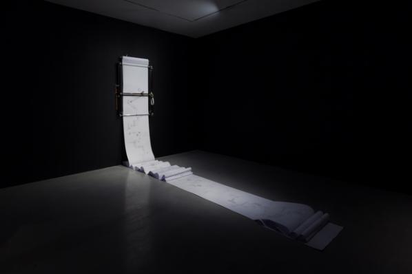
There’s a similar mountain labouring to bring forth mouse situation with Julius von Bismarck & Benjamin Maus’s (ha! Just noticed!) Perpetual Storytelling Apparatus which, in truth, is a beautiful thing to behold –a wall mounted plotter which spews forth a seemingly endless scroll of printed paper, populated, the notes tell us with that hubristic gigantism that so often afflicts such documents, by drawings from “seven million patents – linked by over 22 million references”. The mechanism is easily explained (and perhaps this itself is significant). There is a root text (for one showing it was, apparently, Alice in Wonderland) and by the miracle of software and data equivalence the text is translated into a set of illustrations comprising drawings drawn from the previously mentioned patent database which are then printed out onto the scroll of paper. The artists don’t reveal the source text until after the close of the show. As noted, it’s a handsome process to watch and the drawings have the strange surreal beauty of the technical drawing uprooted from its context but there is an implicit claim made by the artists with their title (supported explicity by the curatorial “New visual connections and narrative layers emerge within the telling of this story through the graphical depiction of technical advancements”) that something resembling a narrative emerges from all this hoo-ha. To put it bluntly – it so does not. You would have to strain your imaginative faculties enormously and do some heavy duty cultural forgetting to even begin to find narrative here, because the images on which the thing piggybacks are so distinctive, strange and beautiful in and of themselves. It’s instructive to compare this rather polished and curator friendly but ultimately disappointing piece with the wonderful and messy anarchy of its distant ancestor, MTAA’s Endnode (aka Printer Tree) of 2002 where a cheap and cheerful plywood tree with printers in its branches dispensed prints of posts to a created-for-the-occasion e mail list. (Images: http://www.endnode.net/install.html background: http://www.endnode.net/index.html)
So I want to finish by saying, once again, this is a great show. There’s a lot of good stuff I haven’t even mentioned, some of Evan Roth’s work in particular. But its basis bothers me a lot – I’m certainly very far from wanting to exclude the digital, the mechanical and the procedural from an as yet to be really seriously defined expanded drawing practice but at the moment it is still drawing’s appeal to and demands on the artist’s embodiment and our embodied imagination that give rise to by far the most engaging work here.
Pencil / Line / Eraser
At Carroll/Fletcher
1 August – 13 September 2014