Art and technology for eco-social change
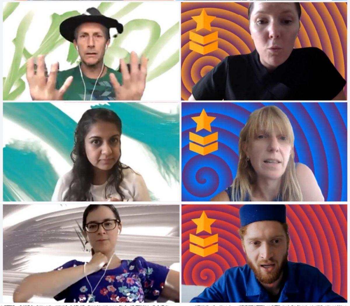
Artist/researcher/curator and co-founder of Furtherfield, Ruth leads on art action research.
Strategist/researcher/writer, Charlotte leads on care-driven cultural strategy.
Artist/researcher/curator and co-founder of Furtherfield, Marc develops media art contexts
Yoki supports Furtherfield’s financial administration and production.
Multidisciplinary design studio working between graphic design, interaction and emergent visual communication.